

Kinsa
Redesign a product that helps parents prevent their children from getting contagious illnesses
Kinsa
Redesign a product that helps parents prevent their children from getting contagious illnesses
Overview
Help parents prevent illness in children through school groups
I worked with Kinsa's CEO and Director of Product to scope out a design sprint that I led to redesign the Groups product in their mobile app. The vision for Groups was to increase illness prevention by enabling parents to see and discuss real-time illness trends at their child's school. Our objective was to improve the user experience and engagement metrics before the product was launched in late 2016.
“Kirby oversaw a project team of designers [and researchers] working on a complete redesign of a feature in our mobile app. The timeline was tight and he and his team delivered excellent, insightful results. His focus on really understanding the user, his command of iterative design processes, and his adept project management skills were all a great asset to Kinsa. ”
Context
Discover what Kinsa does
Kinsa’s mission is to track and stop the spread of contagious disease. The company developed the first FDA-certified smartphone thermometer that works with associated Android and iOS mobile apps to help parents by assessing their child's symptoms, providing age specific health guidance, and sharing what illnesses are going around their child's school. See video below for product demo.
My Role
Lead all facets of the project
My role was to recruit and lead a product design team, oversee client management with Kinsa Health as the client, conduct user research, and execute on the UX + UI design efforts.
“Kirby successfully led a design team through a deep dive into our Groups product and FLUency program. The insights from their user research and design sprint delivered valuable impact by helping us test and prioritize important feature development. The team did a great job partnering cross-functionally with Kinsa throughout the entire project.”
Apply design thinking to the problem
We pursued an iterative, five step process to address the problem of helping parents prevent illness in their children and in their child's fellow students at school. We researched and designed for moms, in particular, as 78% of Kinsa's users were moms at the start of the project. Kinsa was also specifically targeting moms in their marketing and for future user acquisition.

Empathize
Empathize
USER INTERVIEWS
Close the empathy gap
While we can never fully understand the perspectives of those we design for, we must recognize that an empathy gap exists between us and the users. We started our process by conducting contextual interviews with 21 moms, mostly in their homes, to develop an in-depth view on who are target users are, what needs they have, and what motivates their behaviors.
Learn from moms' life context
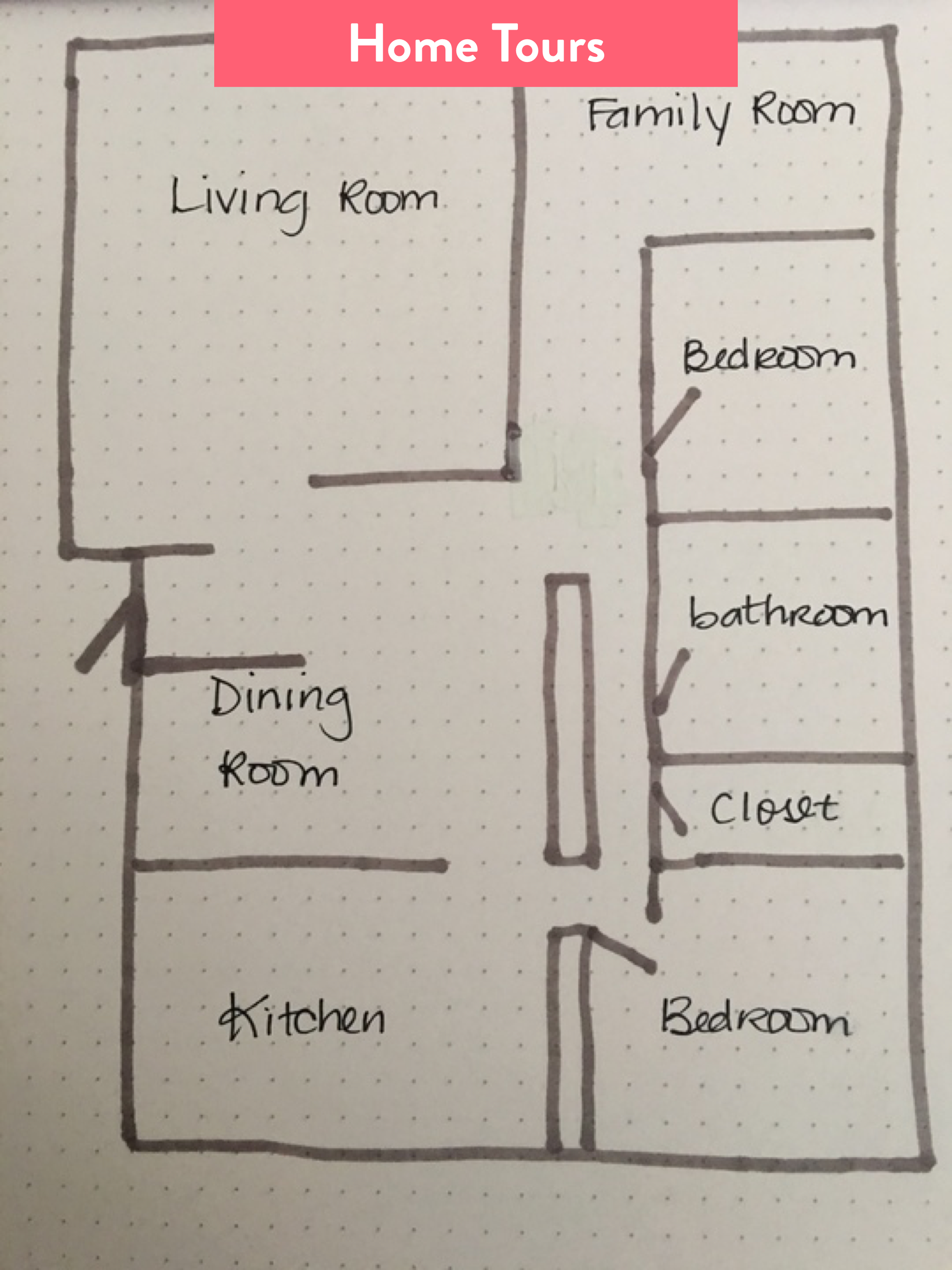
When possible, we went into moms' homes and had them walk us through the last time they cared for their sick child. We used a variety of ethnographic methods to better understand their perspectives, including guided storytelling, contextual interviews, artifact inventory, and home tours.
Discuss what moms say, do, think, and feel in moments of need
We conducted multiple variations of empathy mapping during our user interview process to debrief as a research + design team and to consider any potential refinements to our interviewing approach. This mapping was discussion based and enabled our team to start really appreciating what our users were saying, doing, thinking, and feeling when they are seeking to prevent their children from being sick or when they are treating their sick child.

Define
Define
Insight Generation
Allow for different interpretations
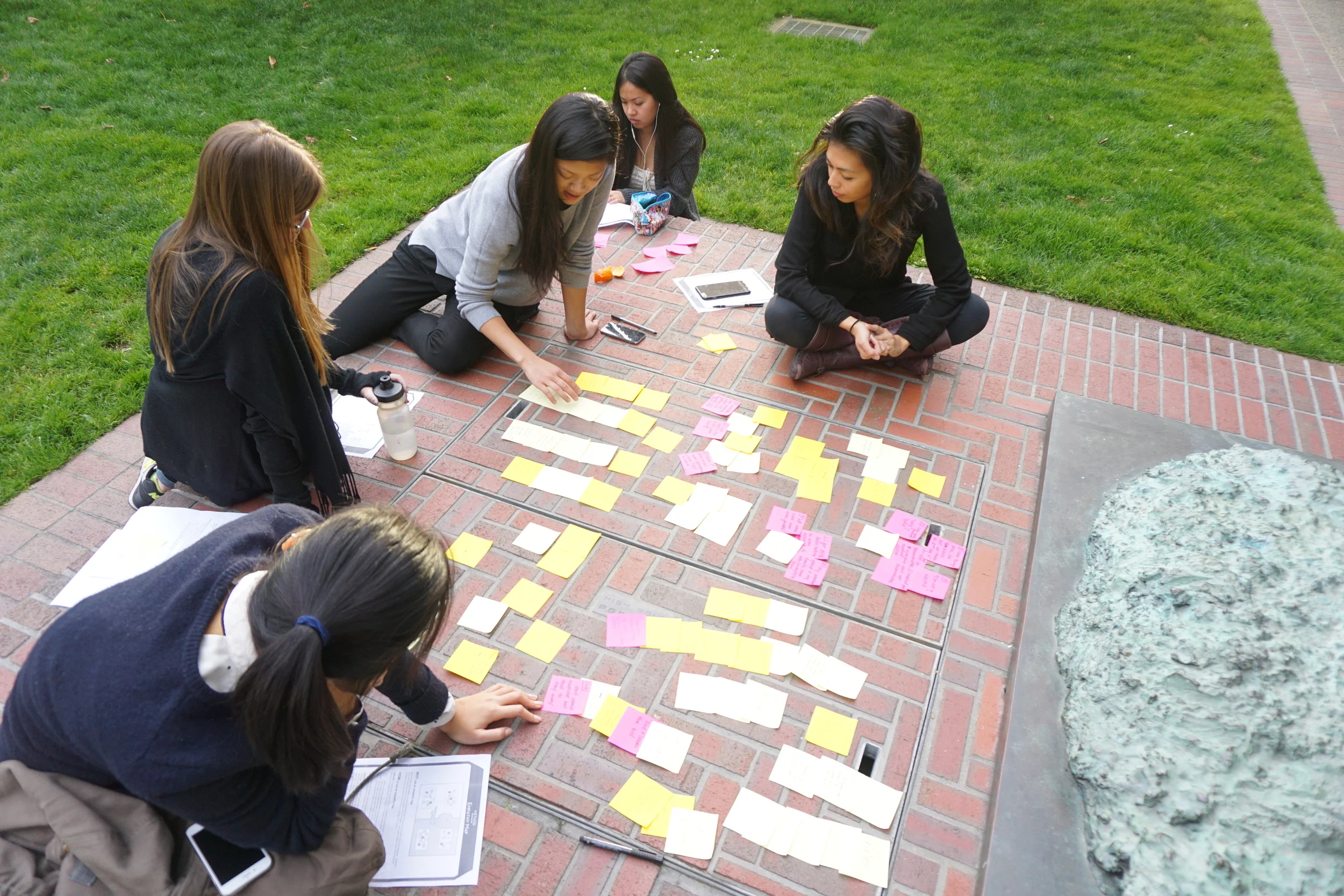
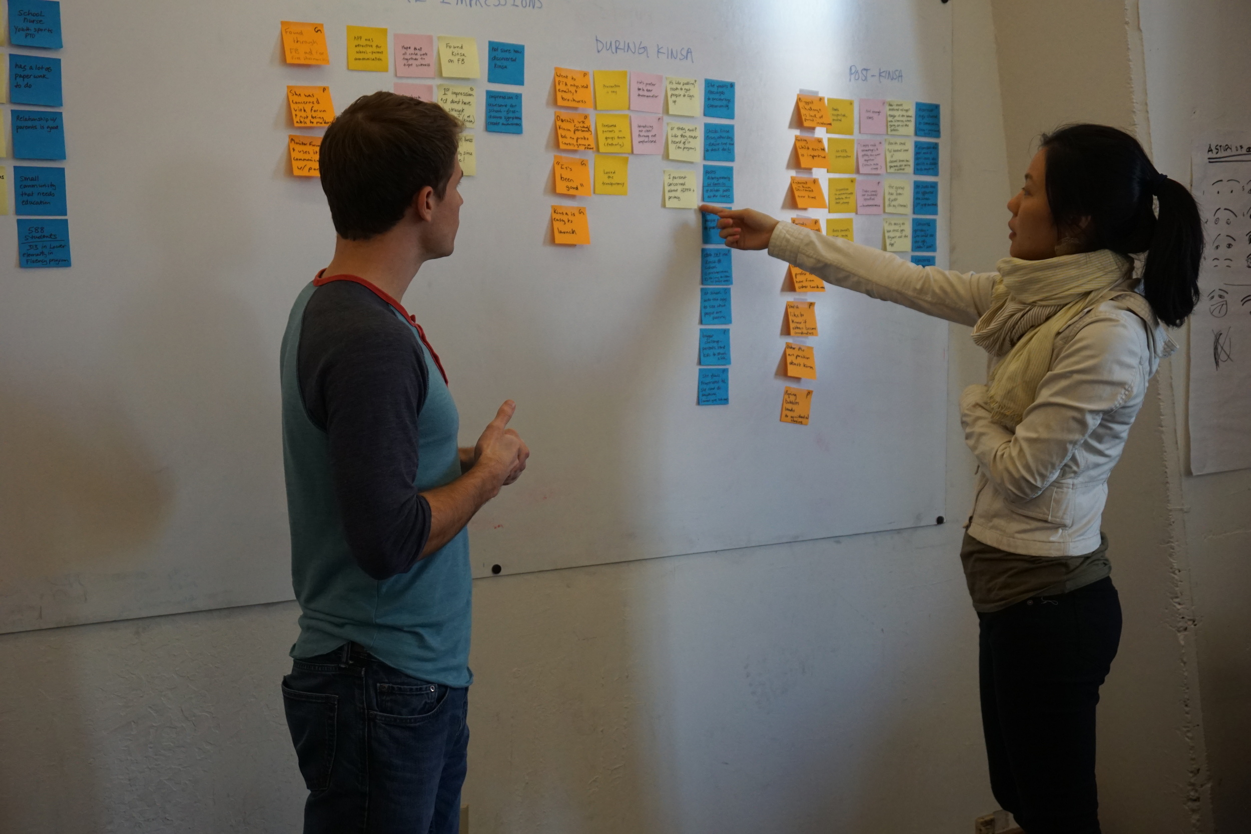
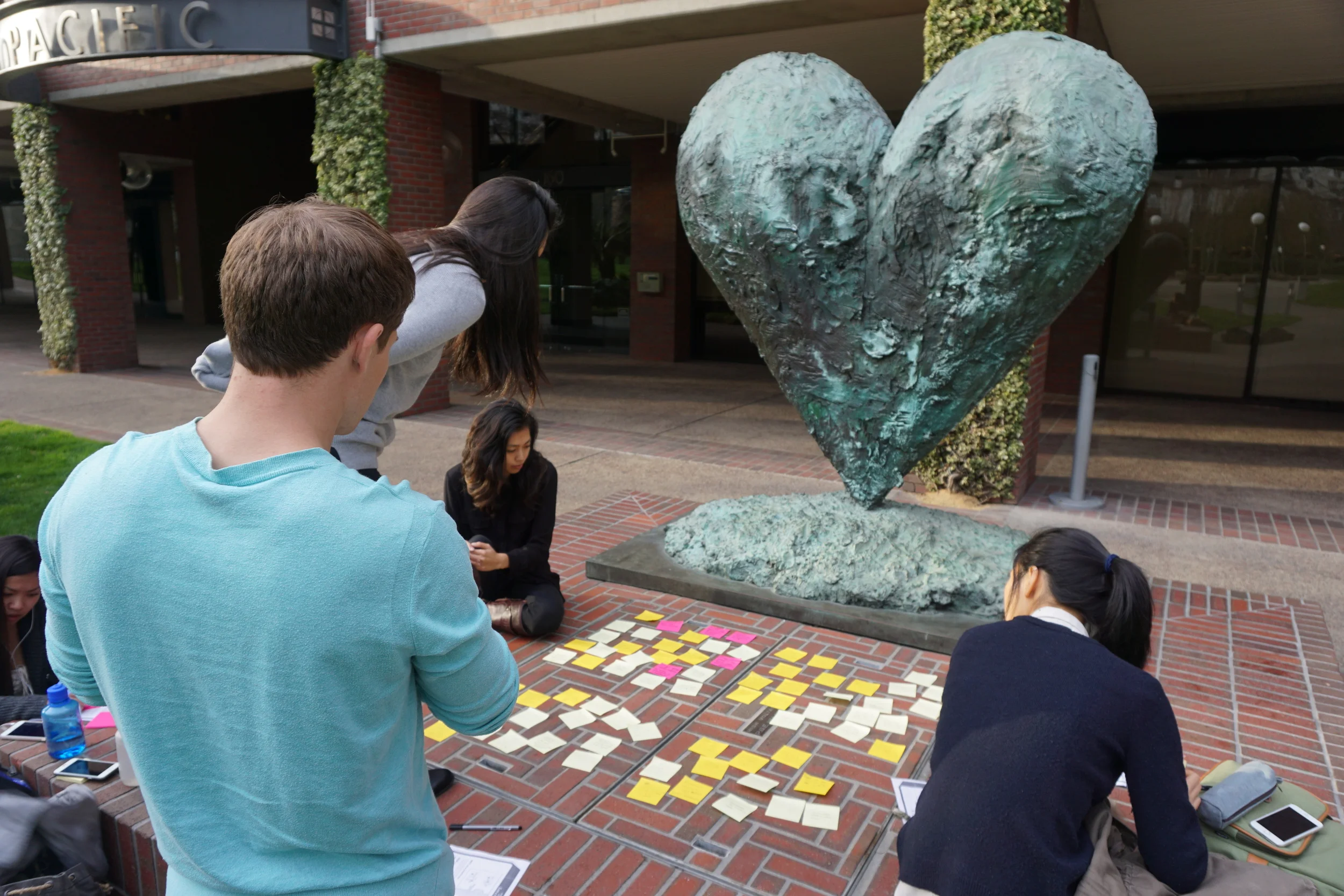
After transcribing and coding the interviews, we created affinity diagrams to focus on generating insights. These diagrams allowed us to visualize the data, tease out patterns, develop hypotheses, and discuss our interpretations of each of the 21 interviews.
Define moms' needs and behaviors
Personas were created to represent the key patterns we identified among the moms we met and helped us humanize the user experience at each stage of our research and design process.
Create hypothesis driven framework to guide design decisions
We distilled our hypotheses into four areas that drove the ideation process, then we translated these user insights into our interactive mobile iOS prototype and user tested with moms.

Ideate
Ideate
Design Workshop
Bring stakeholders together to ideate
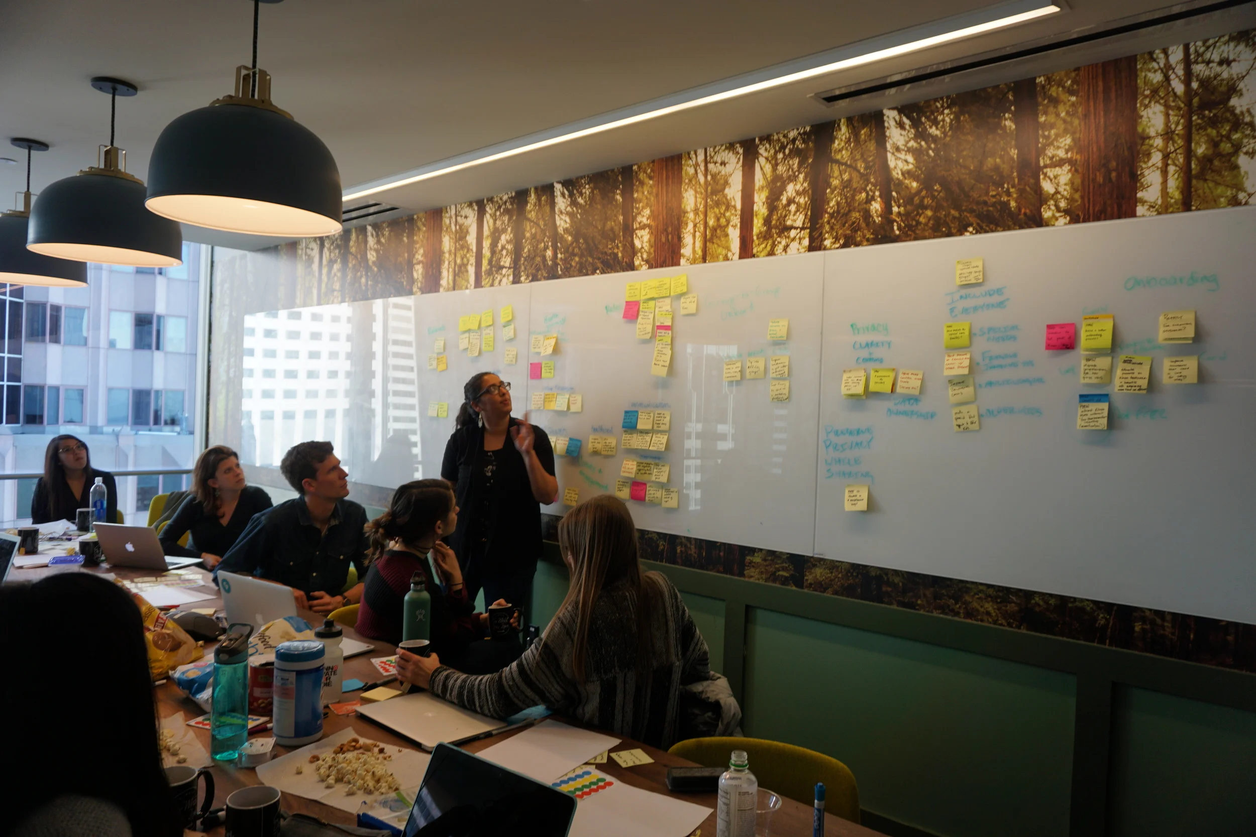
I developed and hosted a 14 person design workshop with our design team and with employees from Kinsa, ranging in functions from Product, Design, Engineering, Marketing, and Customer Service. The workshop began with lightning talks to review key topics and a discussion of "How Might We" address various user needs and behaviors.
Diverge and converge on what's possible
The process of showing our ideas began with divergent sketching. We then would converge with silent dot voting and discussions on which concepts we suspected users would find most engaging. The workshop consisted of multiple iterations of this process and ended with us having agreement on next steps for all the functions involved.
Decide where to focus for prototyping
One area we decided to focus on was the Community Board concept, which featured posting, commenting, tagging, and voting functionality. This feature addresses the need for moms, especially anxious or relatively less experienced moms, to communicate with other moms for the sake of learning what is "going around" the school and to better understand their child's symptoms.
The health card was another area of focus for prototyping. It was designed to provide moms the most relevant snapshot of information whenever they visit the Groups landing page on the mobile app. We decided to prototype and test five variations of the health cards to get a better sense of what information moms would deem most useful.
The Care Coordination concept was our big idea we were going to test with moms in a separate prototype, as it would require entirely new product infrastructure. We decided to focus on this concept because many moms, especially busy or relatively more experienced moms, indicated that getting help with illness care was often a more salient need than prevention.

Prototype
Prototype
Leverage research to inform prototype design
The features we created in the prototypes were designed to test the hypotheses we generated from our research and to get user feedback on the concepts developed in the ideation phase of the project.
The Health Card
Provide a snapshot of key information for moms
We created the health card feature as a five item carousel with each card presenting information that the moms we interviewed indicated would be most useful. One of the health cards was the original health card in the Beta product so that we had a baseline for comparison.
Community Board
Enable moms to post and find what's most relevant to them
In order to address the three variables of relevance that we uncovered in our user research, we created the ability to tag and filter posts by symptoms (likelihood of exposure to child) and diagnosis (severity). The child's school grade (likelihood of exposure to child) was also associated with the account and therefore was tagged on the posts.
Nudge moms to join the conversation, even if anonymously
To make the moms more confident to post / comment and to address potential privacy concerns, we created the option to post and comment as anonymous or using their profile name. Moms could also signal which posts were most helpful with an indictor we designed in the bottom right of each post and comment.
Care Coordination
Try out a big idea - enable moms to coordinate illness care
The relatively more experienced moms in our user interviews indicated that coordinating care of their sick child with their spouse, doctor, school, and other caregivers was the biggest pain of having a sick child. We therefore built a separate prototype that enabled moms to be notified when their kid was sick at school, update their kid's illness history, and coordinate with other primary care givers (e.g., dad or the grandparents) to pick up the child from school all within the Kinsa app.
The second scenario in the prototype also enabled the mom to update the school the next day that her child was still sick while updating this information to her child's illness history as well.

Test
Test
User Testing
Introduce the prototype as a solution to moms' problems
We conducted user testing with 10 different moms. The method used is referred to as Problem and Solution interviewing. The beginning of the interview would seek to understand the mom's background and her problems in preventing and treating illness for her kid, then we would test the extent that our product would address these problems for her. The scripts we used are here.
The Health Card
Determine what types of information are most useful
For each of the five health cards tested, including the original Kinsa design as a control, we would first ask moms their initial impressions then we would ask them on a scale from 1 to 5 (with 5 being the highest) how useful each card was for them and why the given card was assigned it's rating. Moms found the cards with call-to-action buttons on them most useful. The health card which had the ability to notify the school of a sick child increased the usefulness rating by +22% (from a rating of 3.7 for the original Kinsa health card design to 4.5).
Community Board
Assess the conversation's relevance
The redesign of the community board addressed the needs of moms to know the likelihood of exposure to kid, with school grade and symptoms tags, and the severity of the illness, which could be inferred from content of the post and the diagnosis tag. However, moms still couldn't understand how contagious the illness was based on the information provided so we recommended visual contagiousness indicators to Kinsa after user testing.
Privacy Modals
See if moms' privacy concerns are addressed
Although privacy was the number one expressed concern in our user interviews for an app that would share illness related information, 9/10 moms felt that the redesign sufficiently addressed their privacy concerns. We created the privacy modal, which highlighted the ability to post anonymously and the security of the data collected to help address these concerns.

Impact
Impact
Always focus on the impact to the user
Starting our design project with 21 contextual user interviews really set the tone for our approach - we'd continue to think deeply about our users and have their needs lead our design decisions. We were able to successfully deliver impact on our four primary user-centric goals. We identified the key factors in what would drive their engagement with the Groups product, determined what moms find most relevant in seeking to prevent illness for their kids, addressed moms' privacy concerns, and significantly improved the usefulness of the app's health card feature. In the end, Kinsa incorporated our new designs into their mobile app as they graduated the Groups product out from Beta into full production in late 2016.


